Step 2
Notice the app is styled with Chakra UI, a styled component library that gives you the building blocks you need to build your React applications.
If you start a project from scratch, you can add Chakra UI as follows.
- Install the library
npm install @chakra-ui/react @emotion/react@^11 @emotion/styled@^11 framer-motion@^4 @chakra-ui/icons
- Update the
index.jsto use theChakraProvidercomponent. This component will include the required CSS files as well as other things.
import ReactDOM from "react-dom";
import App from "./App";
import { ChakraProvider } from "@chakra-ui/react";

ReactDOM.render(
  <ChakraProvider>
    <App />
  </ChakraProvider>,
  document.getElementById("root")
);
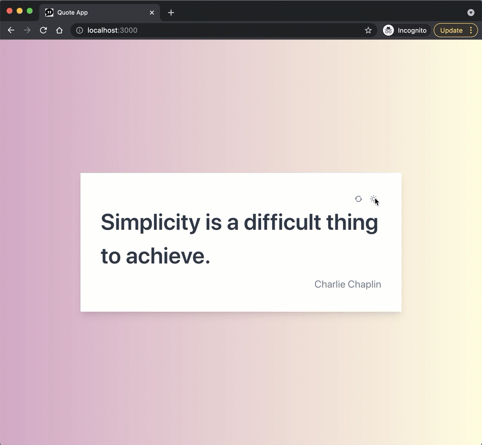
Go ahead and build the App with Chakra UI components! This application has used components like Container, Box, Stack, Text, Center, and IconButton.
Moreover, this app provides a simple mechanism to toggle between light and dark themes. Namely, a boolean variable darkMode is used as part of the application's state. A toggle button switches this variable to true. The components styling is conditioned upon the value of darkMode—for example, the gradient background changes according to the darkMode flag.
<Center
  w="100%"
  minH="100vh"
  bgGradient={
    darkMode
      ? "linear(to-r, #2C3E50, #4CA1AF)"
      : "linear(to-r, #d9a7c7, #fffcdc)"
  }
>
This strategy is the simplest approach to theming! However, Chakra UI provides more advanced theming features and makes switching between light and dark modes easy. Please consult the following resources.